A new feature for an existing app, Diabetes: M
My Circle
Role
Overview
Student, Pratt Institute UX/UI Mobile Design Certificate Program
User Research, UX/Ui Design
Spring 2020
For this class project, I researched and created a way for people with Type 1 diabetes to better communicate their blood sugar levels with their family members and caregivers.
Problem
Type 1 diabetics (T1Ds) must continuously regulate their insulin intake in order to manage their blood sugar levels and avoid critical conditions. Meanwhile, the families of people with Type 1 diabetes often worry about them, especially when they are apart.
Diabetes is hard on both diabetics and their families/caregivers. How might we help improve the communication between diabetics and their caregivers, without being overbearing?
Research
First, I conducted user research via an online survey and remote user interviews. Since this feature has two target users, I created two separate surveys and sets of interview questions - one for the TD1 and one for the caregiver.
Survey results showed that:
64% of caregivers worry about the blood sugar levels of their T1D when they are apart
58% of caregivers say their T1D typically communicates their blood sugar levels to them verbally
60% of caregivers rated their activity level as a 4 (out of 6) or higher, when it comes to helping their T1D manage their diabetes
Based on these findings, I created two users personas to help bring the complex relationships associated with T1D and being a caregiver to life.
Design
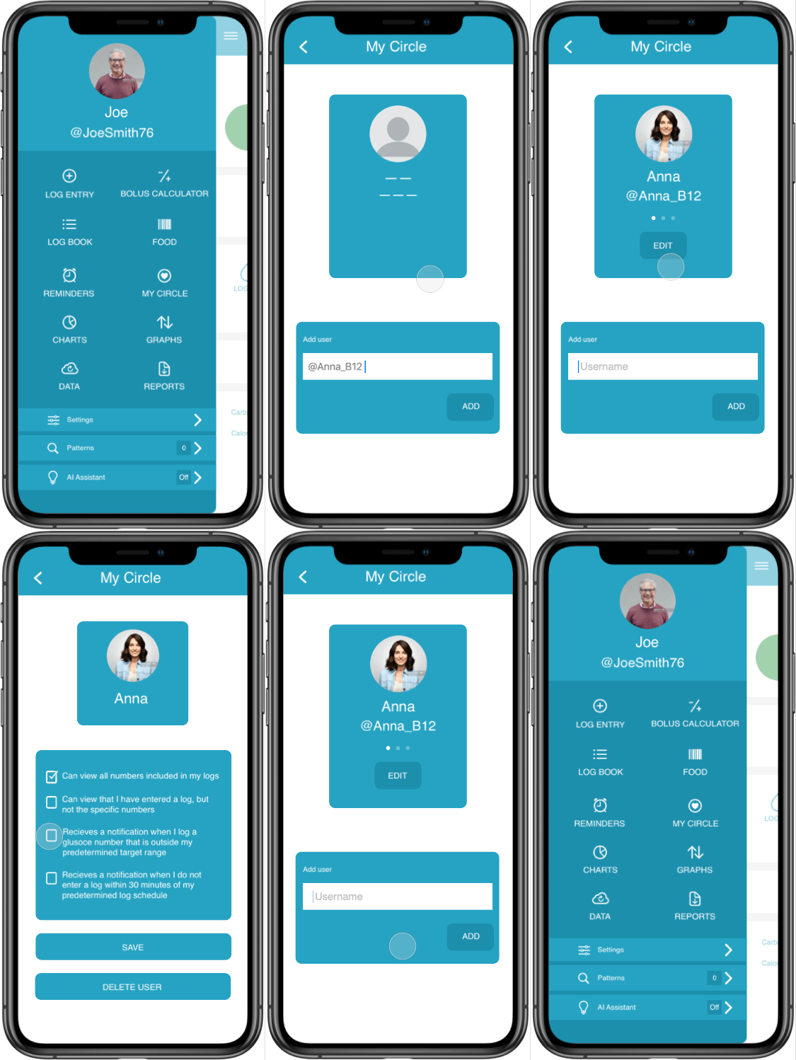
Diabetes: M app main menu
Home screen of My Circle feature in empty state
In app notification nudging user to set up the My Circle feature
Adding a user to your Circle
My Circle feature home screen
Editing preferences of a member of My Circle
Prototype
Real Life Implications
Retrospective
This concept did not reach the development process since it was created for a class project. However, if I were to continue the process my next steps would include:
Expand user research and interviews. This feature was created for a highly specific target user regarding a personal and potentially sensitive topic. Additional time and resources would allow for a larger pool of respondents and interviews which could lead to additional insights.
Conduct usability testing with both sets of users and continue evolving the design accordingly.
Create a full mockup of what the app and My Circle feature would look like for the caregiver user.


