Hudu Technologies, Inc.
A New Dark Mode
Overview
Hudu is a documentation platform utilized by IT professionals and managed service providers. From the start, dark mode was a highly requested feature. While Hudu did offer a dark mode theme, there was much room for improvement. After joining the company as the founding product designer, I set out to establish a design system and completely overhaul the existing dark mode.
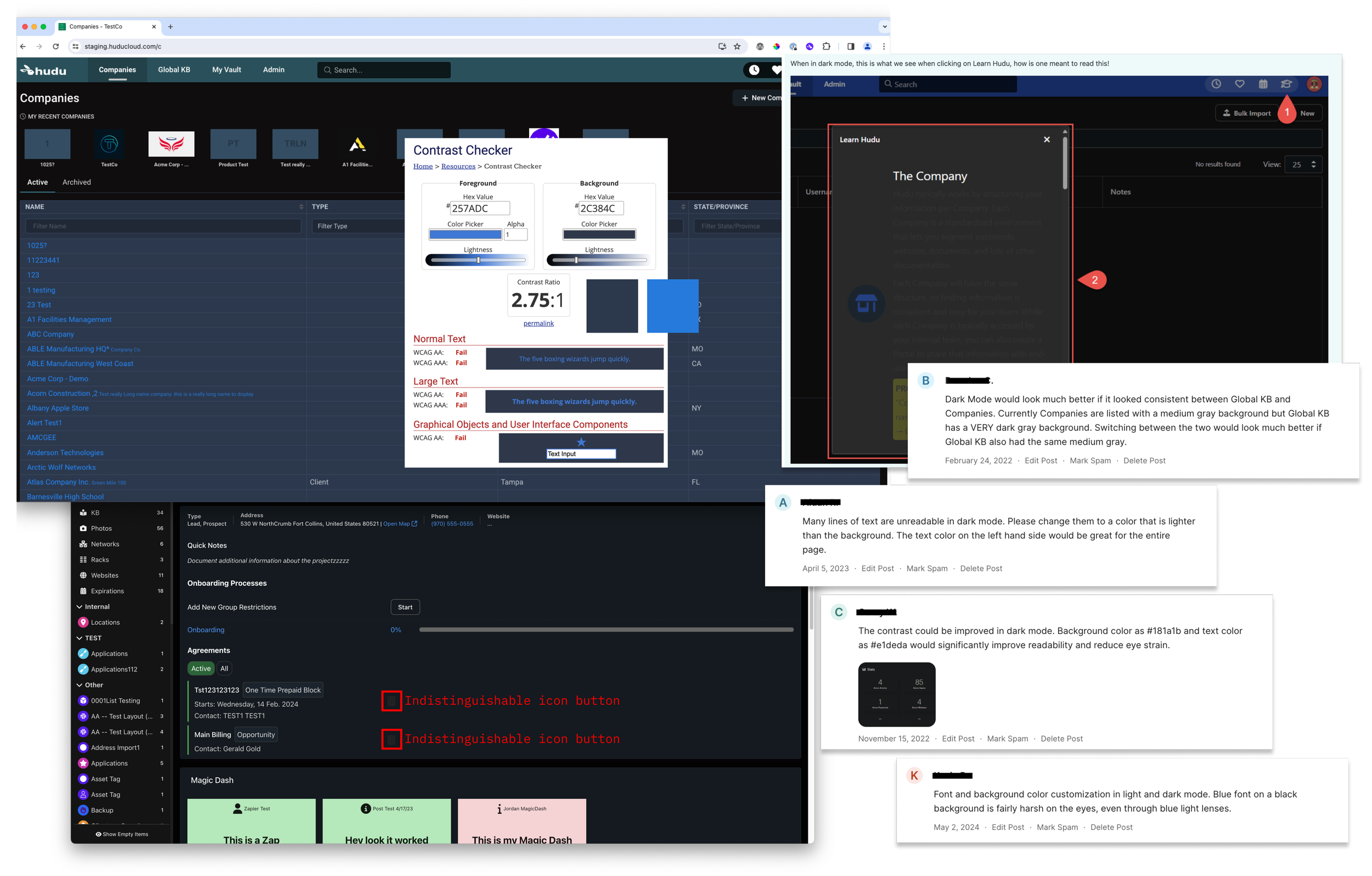
WCAG AA standards include 3 key color contrast requirements for text, links, and design components. The exiting dark mode theme rarely met any of these requirements. This meant that some text and page elements such as icons were sometimes illegible.
Contrast
Range
While it may sound counterintuitive, the existing dark mode color palette was too dark. It lacked the range of “dark” neutral colors needed to convey depth, which led to a 1-dimensional look. It also lacked dark mode versions of accent colors and alert colors such as the green used to convey success and the red used convey errors.
Consistency
Links and buttons were used interchangeably and inconsistently. This alone was an issue, compounded by the fact that the existing dark mode link color was severely inaccessible. Additional color inconsistencies across the theme ultimately gave the impression that dark mode was unfinished.
Design
Research examples & dark mode best practices
List color use cases and states
Identify color values
Test combinations for color contrast